Sber: The centre of everyday life
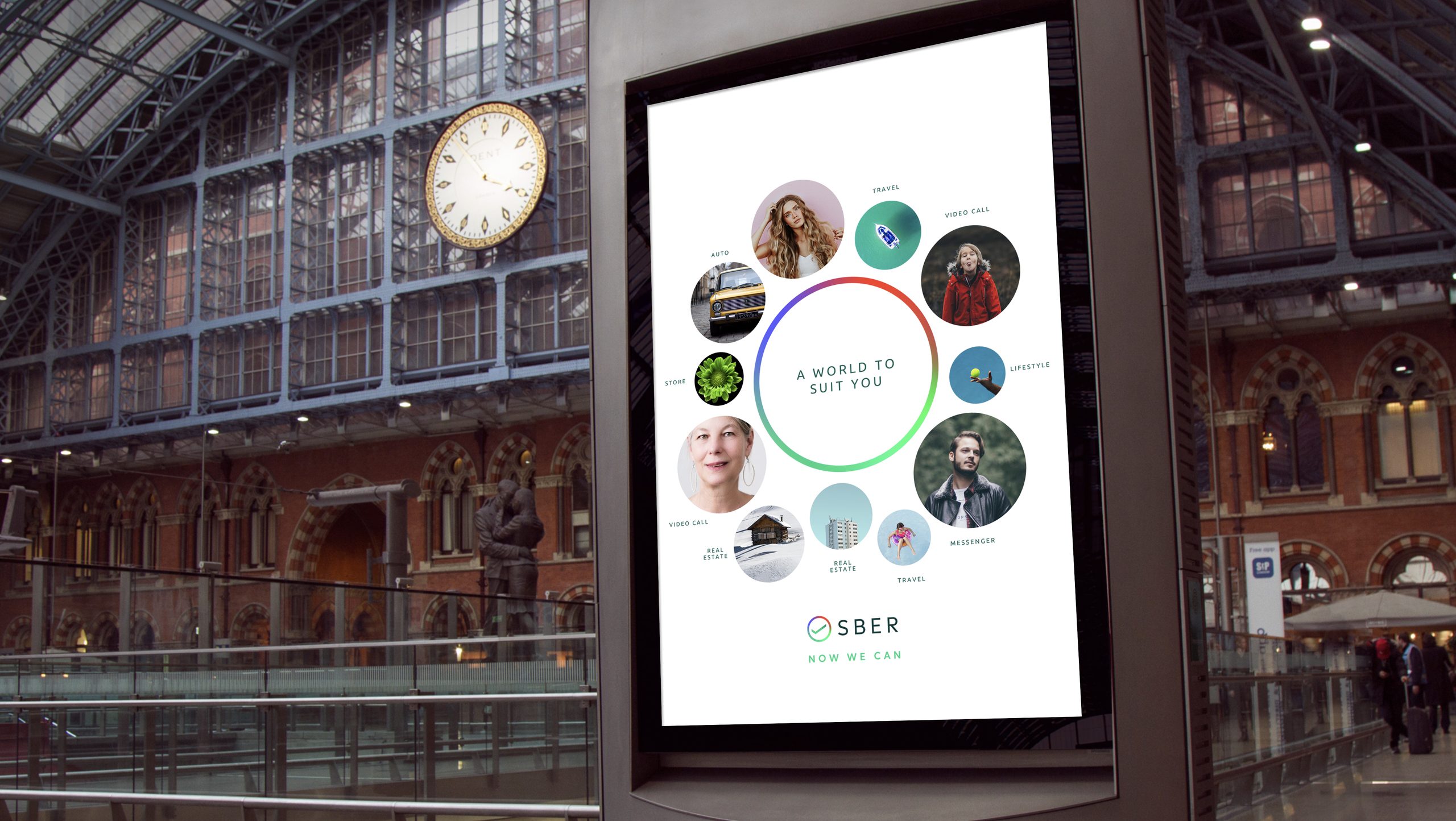
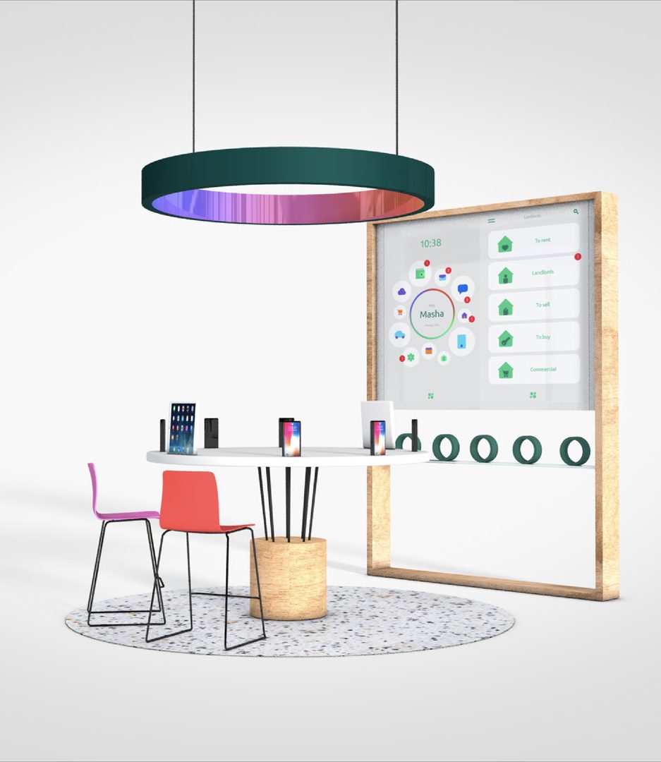
Sberbank was becoming more than a bank, with services in telecoms, health, retail and real estate. We reduced its symbol to a single tick inside a circle, and built a world around it.
Challenge
As Sberbank expanded beyond banking, the brand had to grow with it, and bring every service together in one connected experience.
It had to keep the trust of a national institution while stretching across entirely new categories and products.
Solution
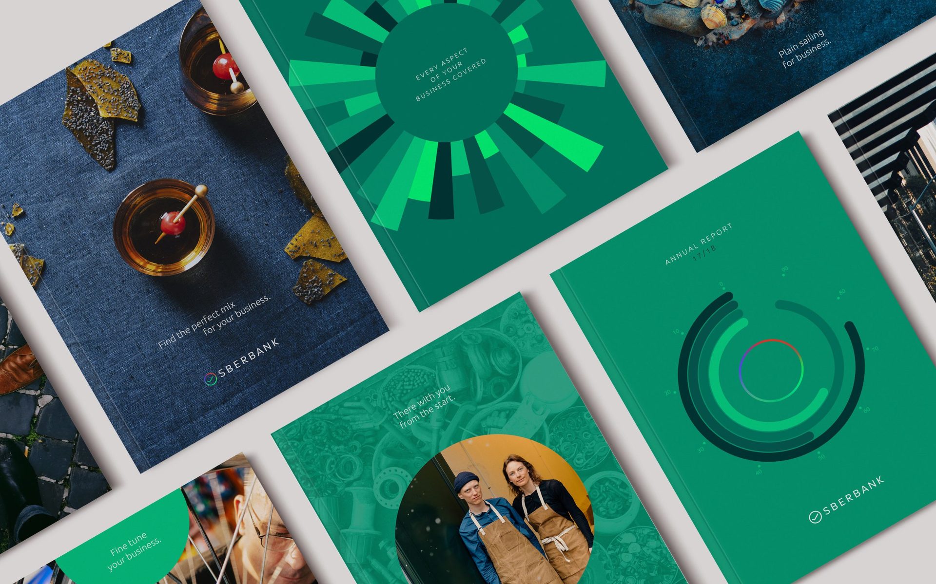
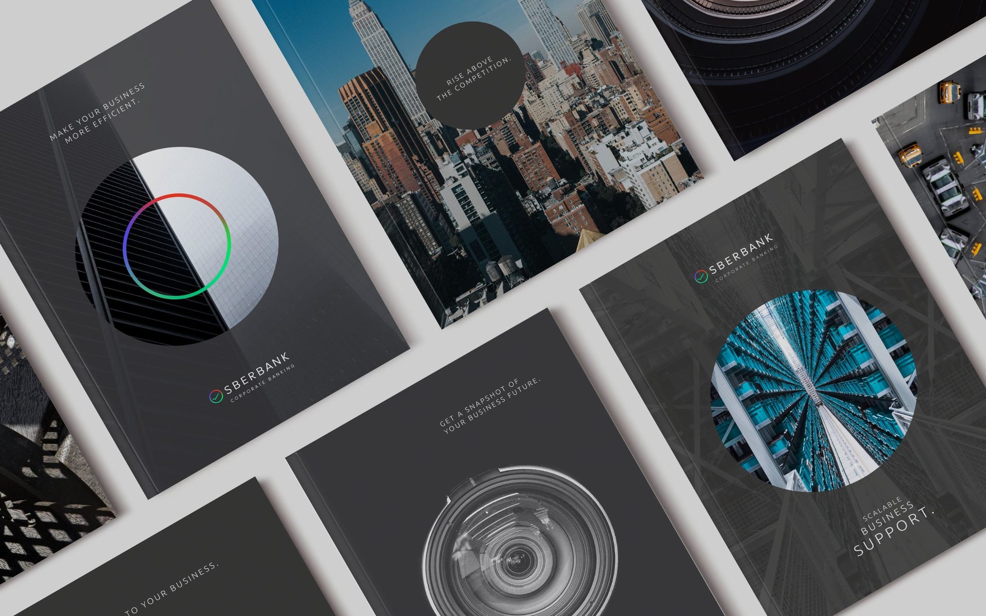
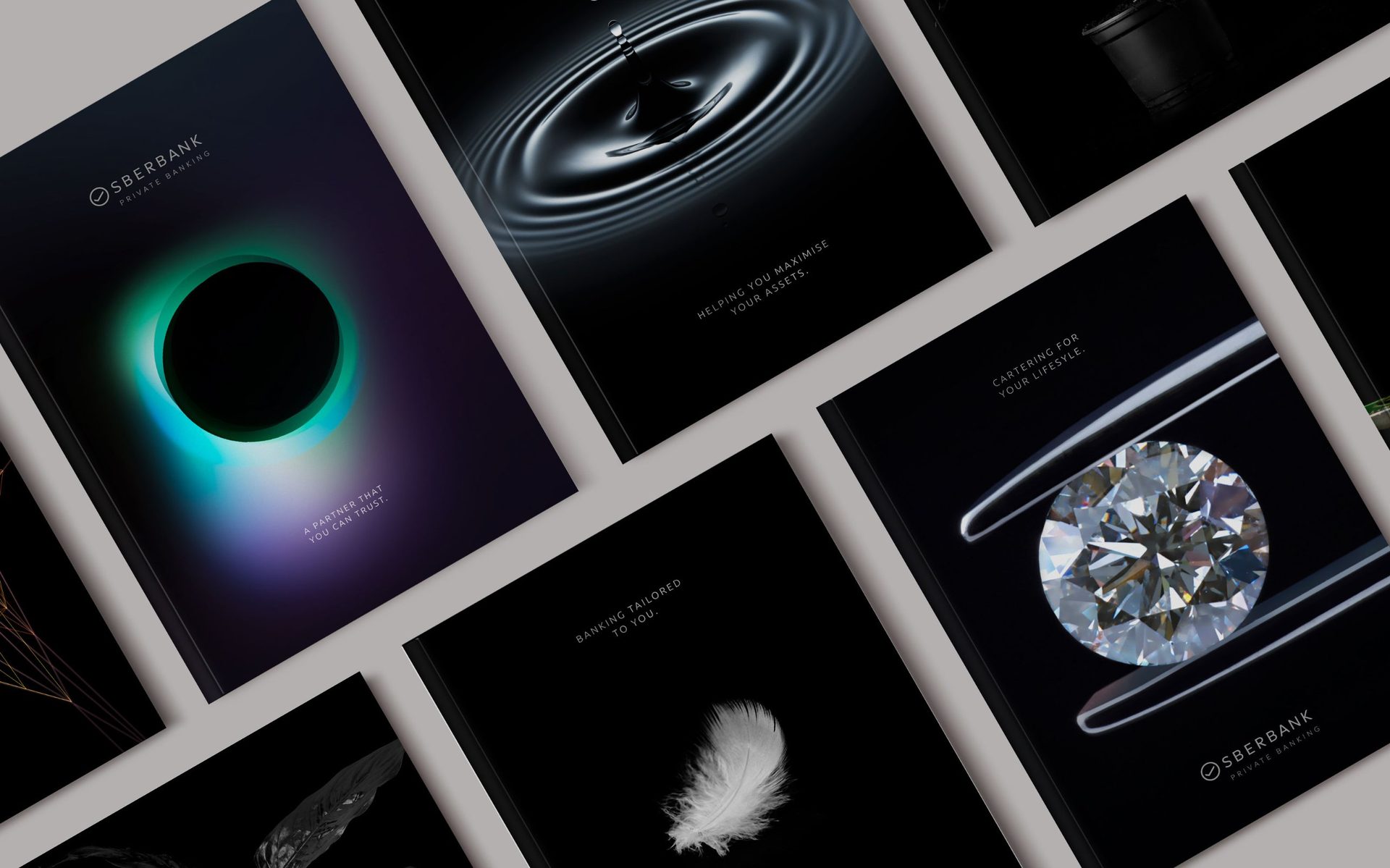
We repositioned Sber as a one-stop platform built around the user, with a flexible circular visual language at its centre.
The logo was radically simplified: a contemporary sans serif replaced the traditional serif, and the symbol was reduced to a single tick inside a circle.
Together, they turned a traditional bank into a connected platform for modern life.
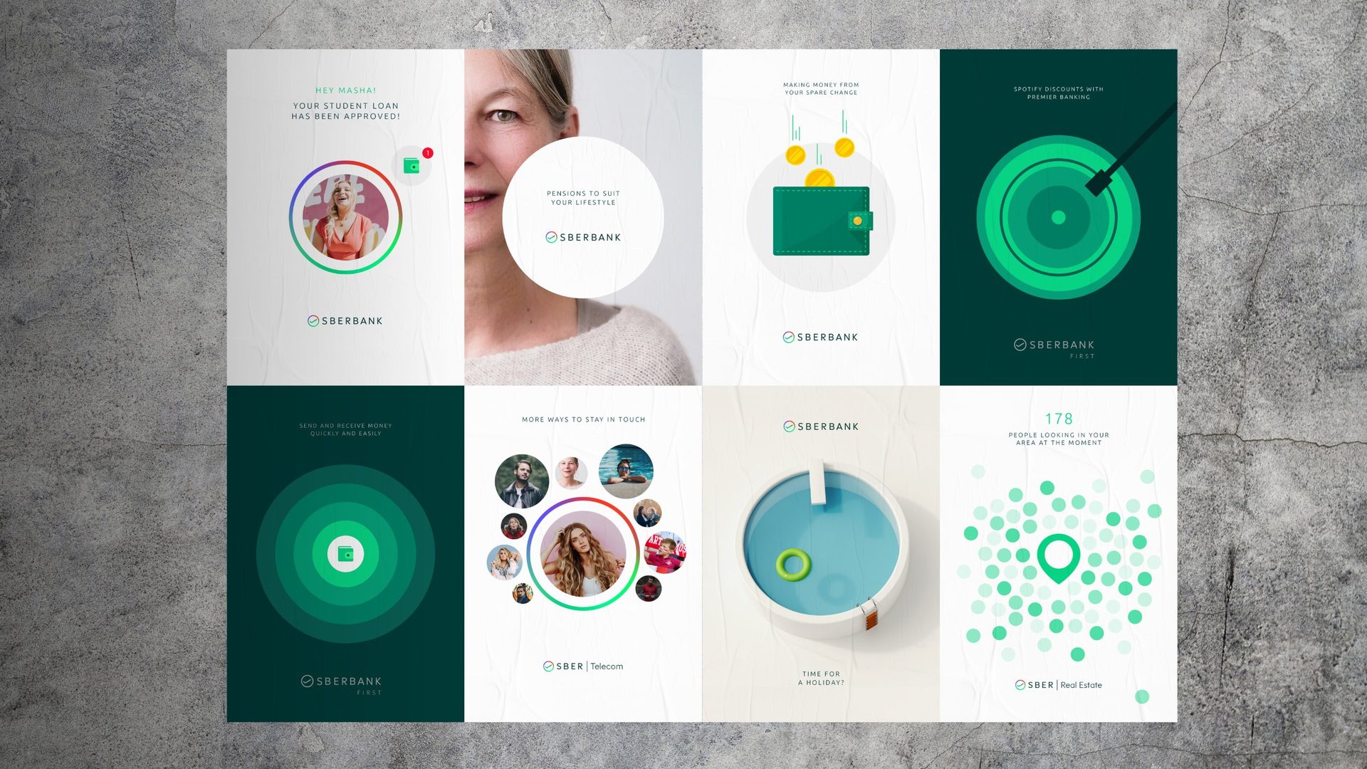
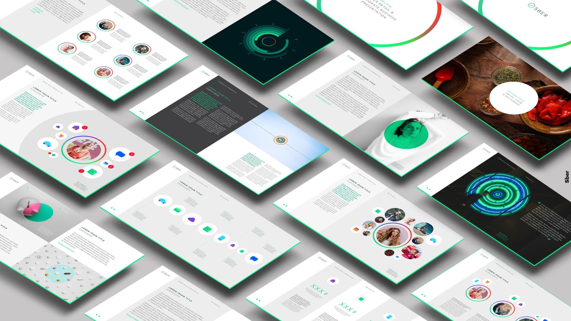
Designed to flex across every audience.
The result
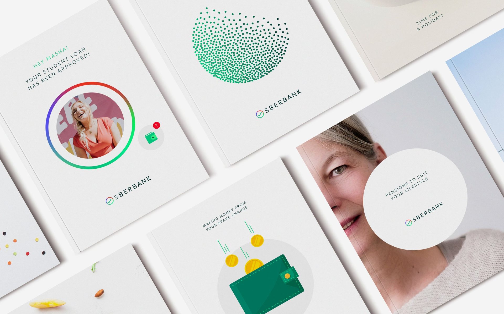
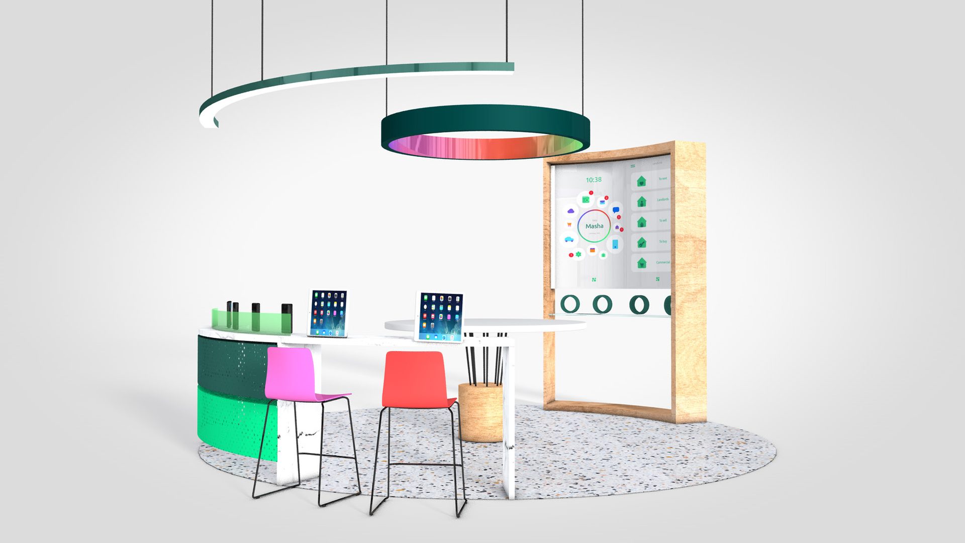
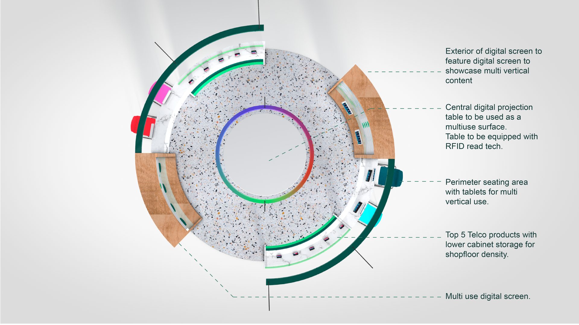
The new identity brings Sber’s whole ecosystem of services and touchpoints under one expression.
Sber went from one of Russia’s best-known banks to a technology brand, built for the next generation of connected services.
- My role
- Lead designer and creative pitch lead
- Agency
- Landor
- Duration
- 1-month sprint
- Scope
- Positioning, identity, logo, visual language, motion, brand experience