Moeve: The green energy molecules champion

For nearly 100 years, CEPSA was a pillar of the oil and gas industry in Spain and Portugal. Then, in 2022, a new CEO arrived with a radical ambition: become the green energy molecule champion of this decade.
The question
CEPSA knew their brand was a major business asset, and that putting it behind this transformation was a bet on their identity, their reputation and their future. So before designing anything, we modelled three scenarios: retain the brand, refresh it, or launch something entirely new.
The process was rigorous. Stakeholder and shareholder interviews, sessions with the SteerCo and Board, expert interviews, and quantitative and qualitative testing across hundreds of consumers in key markets. Every element was tested: names, positionings, logo prototypes, full identities.
The data was decisive. A bold new brand would unlock significantly greater business value, driving differentiation, category leadership and investor confidence that a refresh simply couldn’t.

The answer
Moeve
The new name is one letter from “mueve”, Spanish for “move”. The name embodies the optimism of a sustainable future, aligning with the brand’s strategy: Positive Motion.
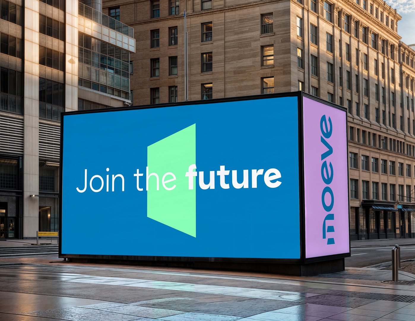
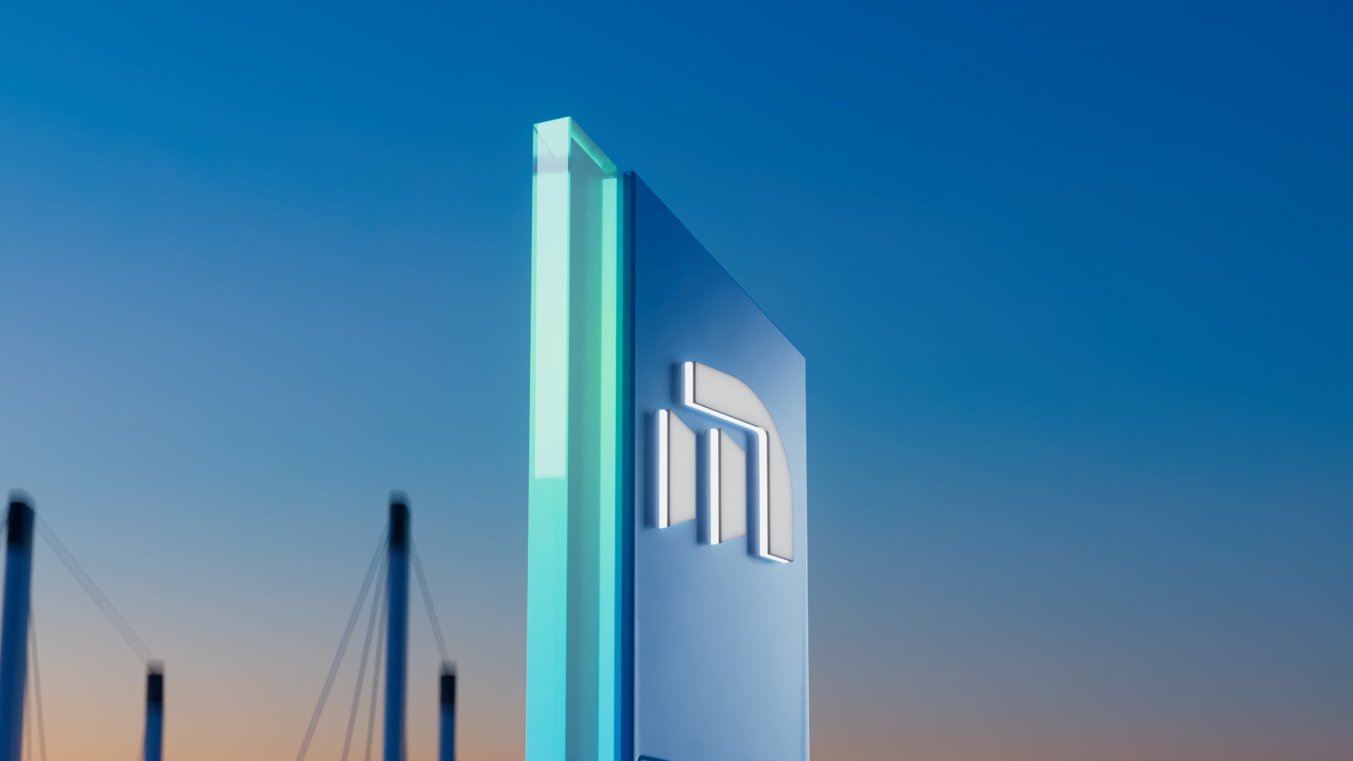
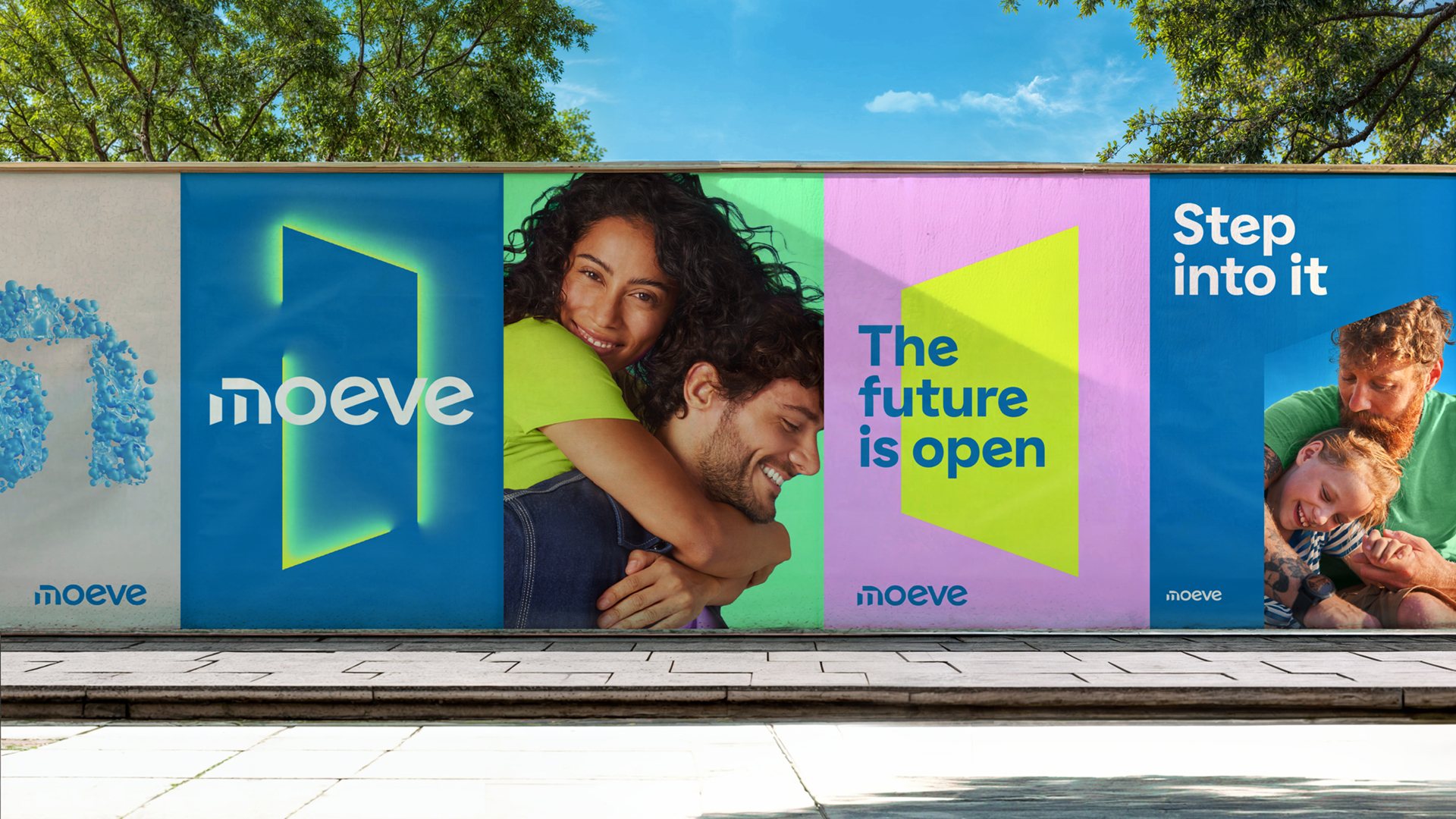
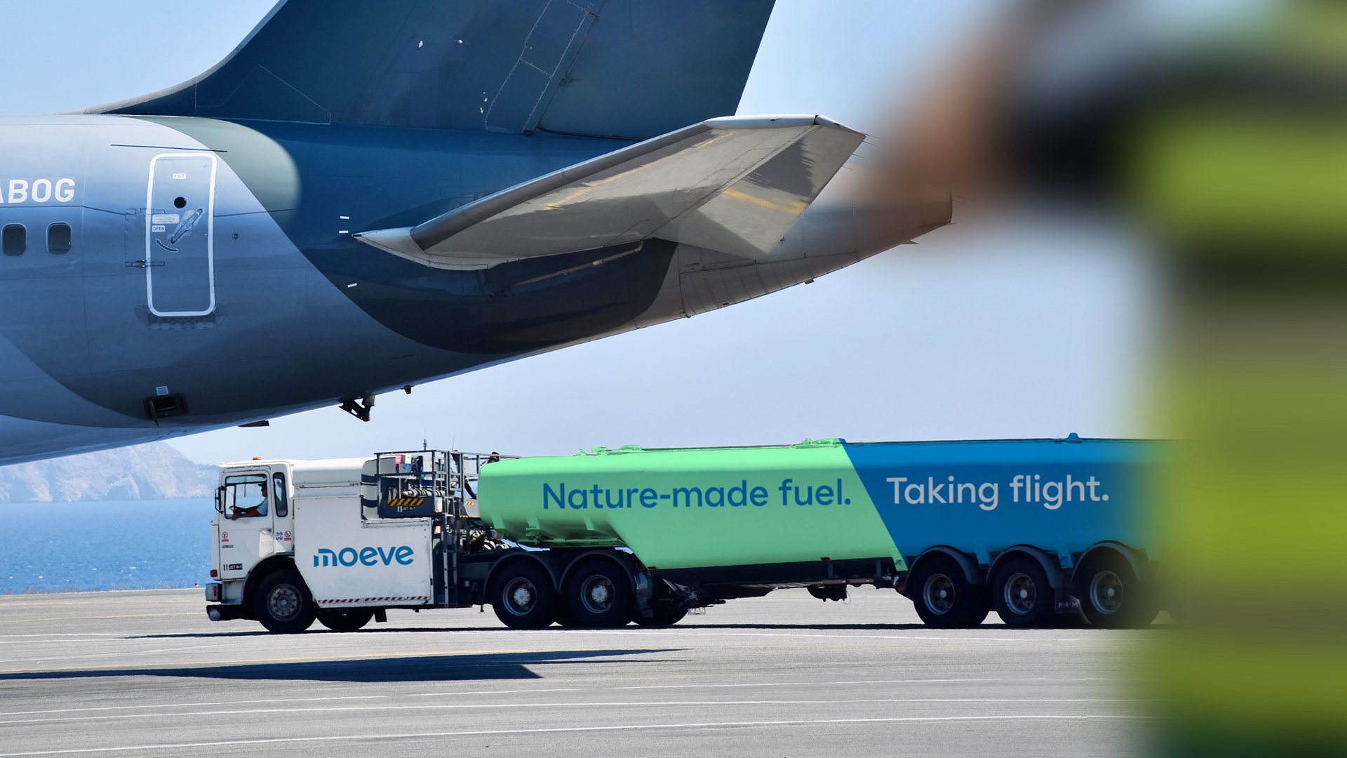
The visual identity deliberately breaks with industrial category codes. Light, colour and optimism over steel and seriousness. The wordmark’s open doors, always letting light in, signal a brand that sees the world not as it is, but as it could be. When you open doors and let in optimism and hope, you make the impossible possible.
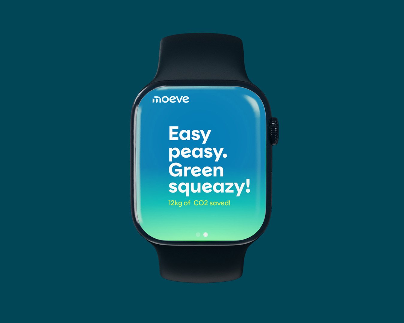
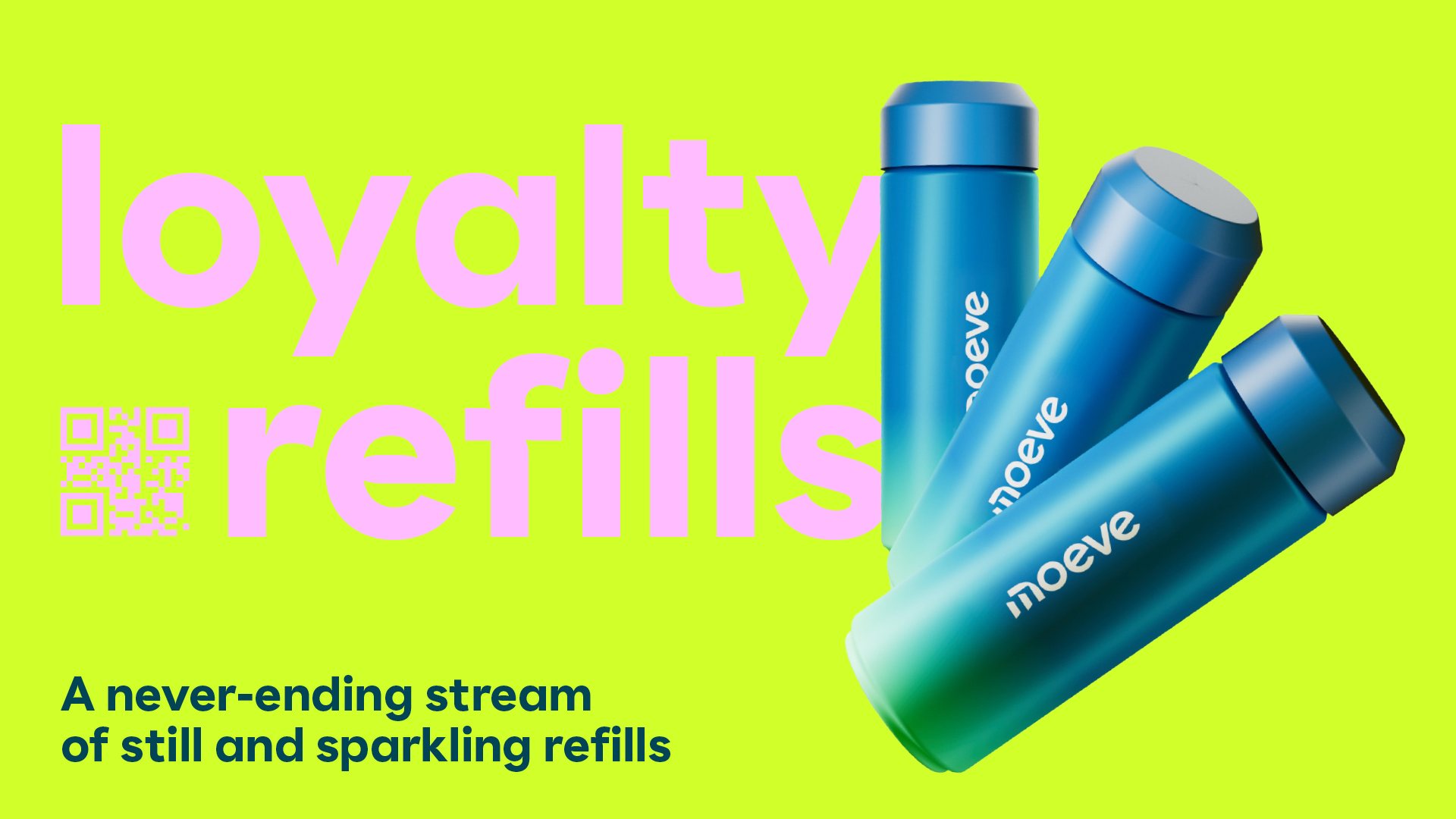
A 360 brand experience followed: a dynamic wordmark, a sonic identity built on clarity and can-do energy, and a tone of voice with more wit and charm than the category had ever allowed itself.
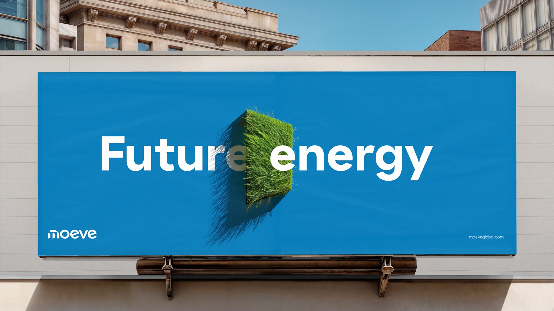
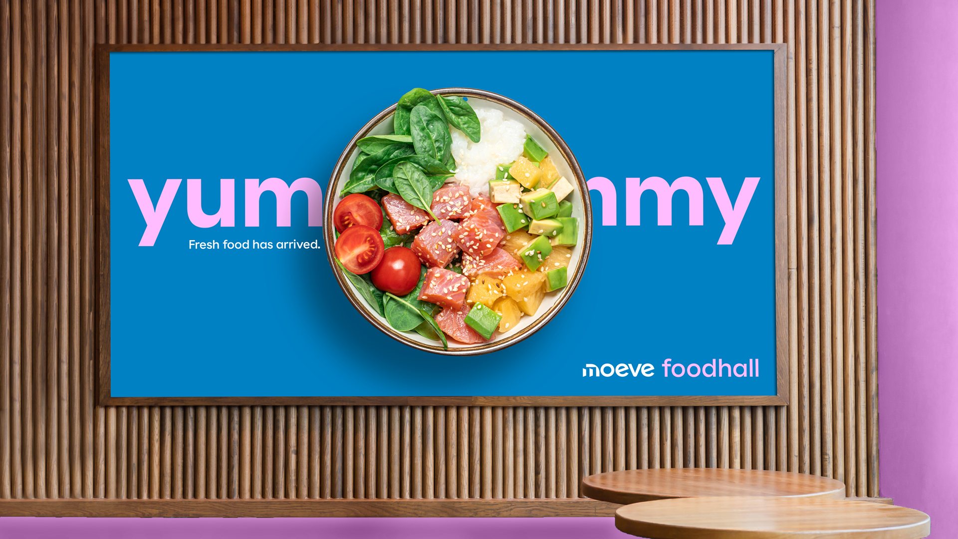
Visual, verbal, digital, experience and architecture in service stations, sonic, employee experience, service design, motion ecosystem, office design. All backed by certainty.

The result
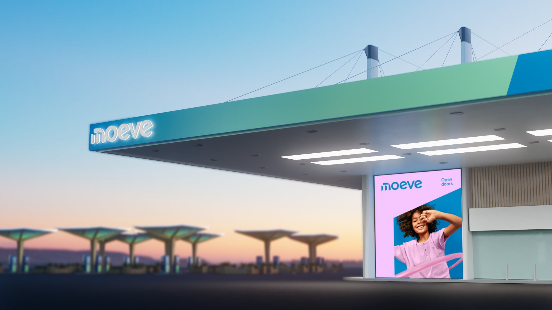
Moeve launched in October 2024 to an overwhelming press response, including the Financial Times Reinvention Champion award for the energy sector. The identity is now rolling out across 1,800 sites in Spain. Moeve’s flagship Madrid forecourt, with food, EV charging, baby facilities and green spaces, shows what a service station becomes when it stops thinking like one.
The brand defines a new category. And Moeve intends to own it.
- My role
- Design director: won the pitch and led a core Landor team of eight creatives, with cross-agency creative direction of The Cocktail, AMP, Design Bridge and Partners, Publicis and Burson
- Agency
- Landor
- Duration
- 2 years, strategy to launch
- Scope
- Positioning, identity, typography, motion, brand system
Created while Design Director at Landor.