Corporate Traveller: Business travel on cloud 9

Corporate Traveller built its name on care. As digital-first rivals moved in, we made that care visible, with a helping hand at every touchpoint.
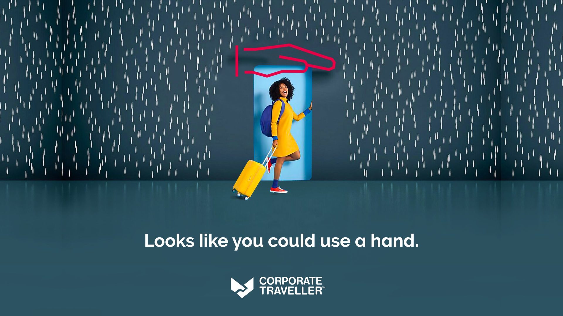
Challenge
Corporate Traveller needed to modernise without losing the warmth and personality that made the brand successful in the first place.
The challenge was to stand apart in a category of generic travel imagery, functional messaging and look-alike tech.
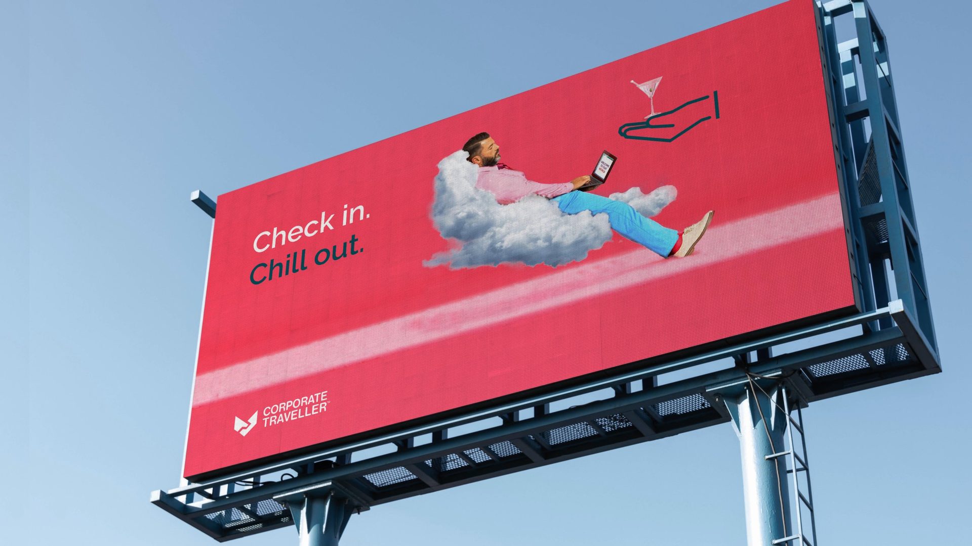
Solution
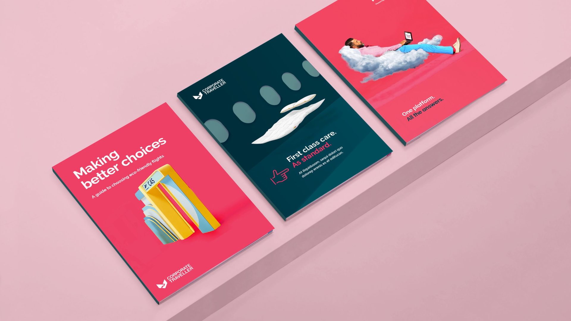
We turned Corporate Traveller’s service into a world of “care uplifted”: a playful identity inspired by magic, where friction disappears and business travel feels effortless.
Expressive hand gestures became the brand’s signature device. They grew out of Corporate Traveller’s historic logo, which we brought up to date and set in motion. Bold colour and a distinctive photography style complete the system and sets them apart from the competition.
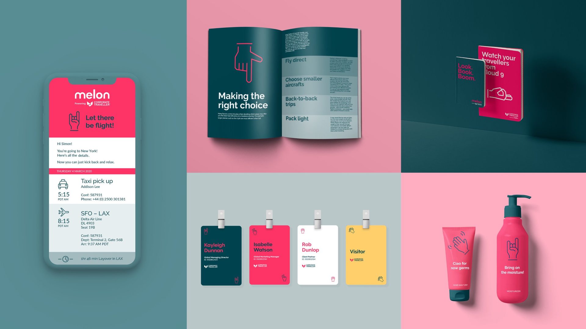
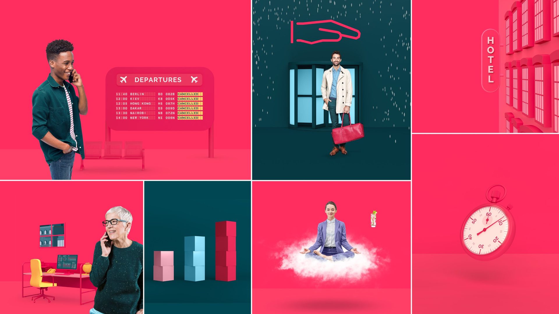
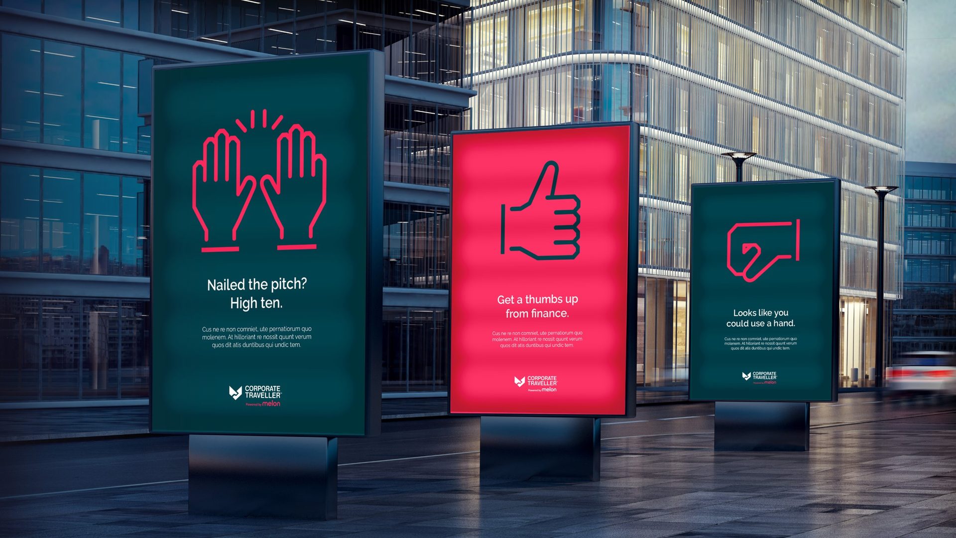
The result
Corporate Traveller came away with a brand that can stand proud beside its digital-native rivals, while keeping what has always set it apart: care and a human touch.
- My role
- Lead designer: took the identity from concept to guidelines, overseeing 3D and digital
- Agency
- Landor
- Duration
- 3 months
- Scope
- Positioning, identity, photography, communications, digital