BBVA rises to the opportunity
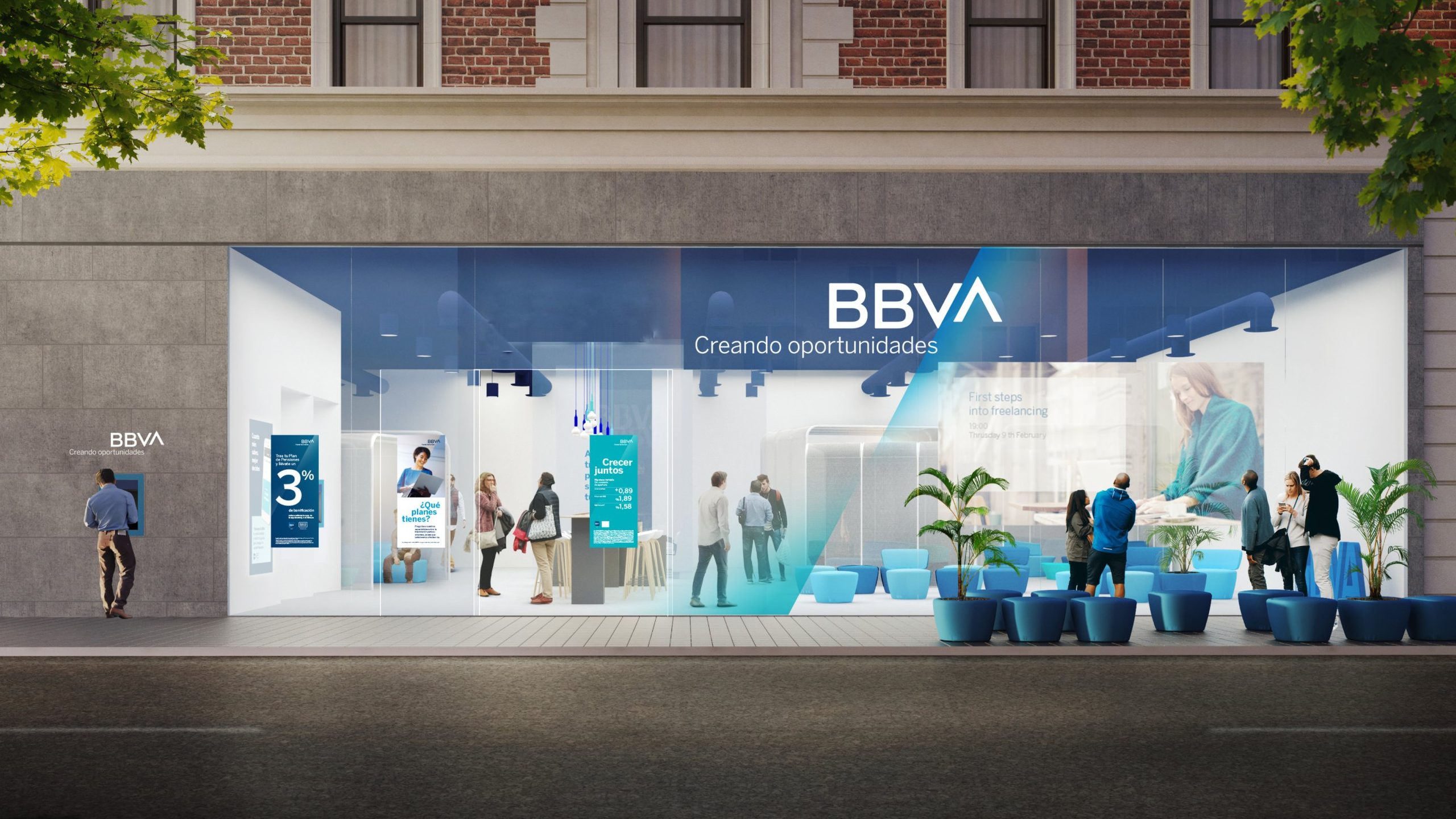
As BBVA grew through acquisitions, it needed one identity to unite its regional banks. We found it in a single letter: the A became an ascender.

Challenge
BBVA’s international growth had created a fragmented brand architecture across markets.
The task was to bring them together under one global identity, without losing the equity BBVA had built over decades. And BBVA was becoming a more digital business.
Solution
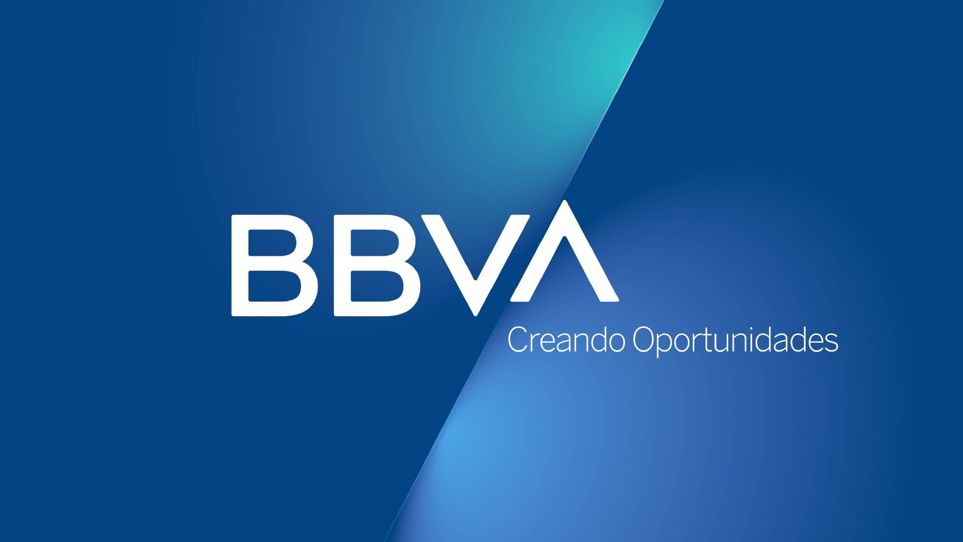
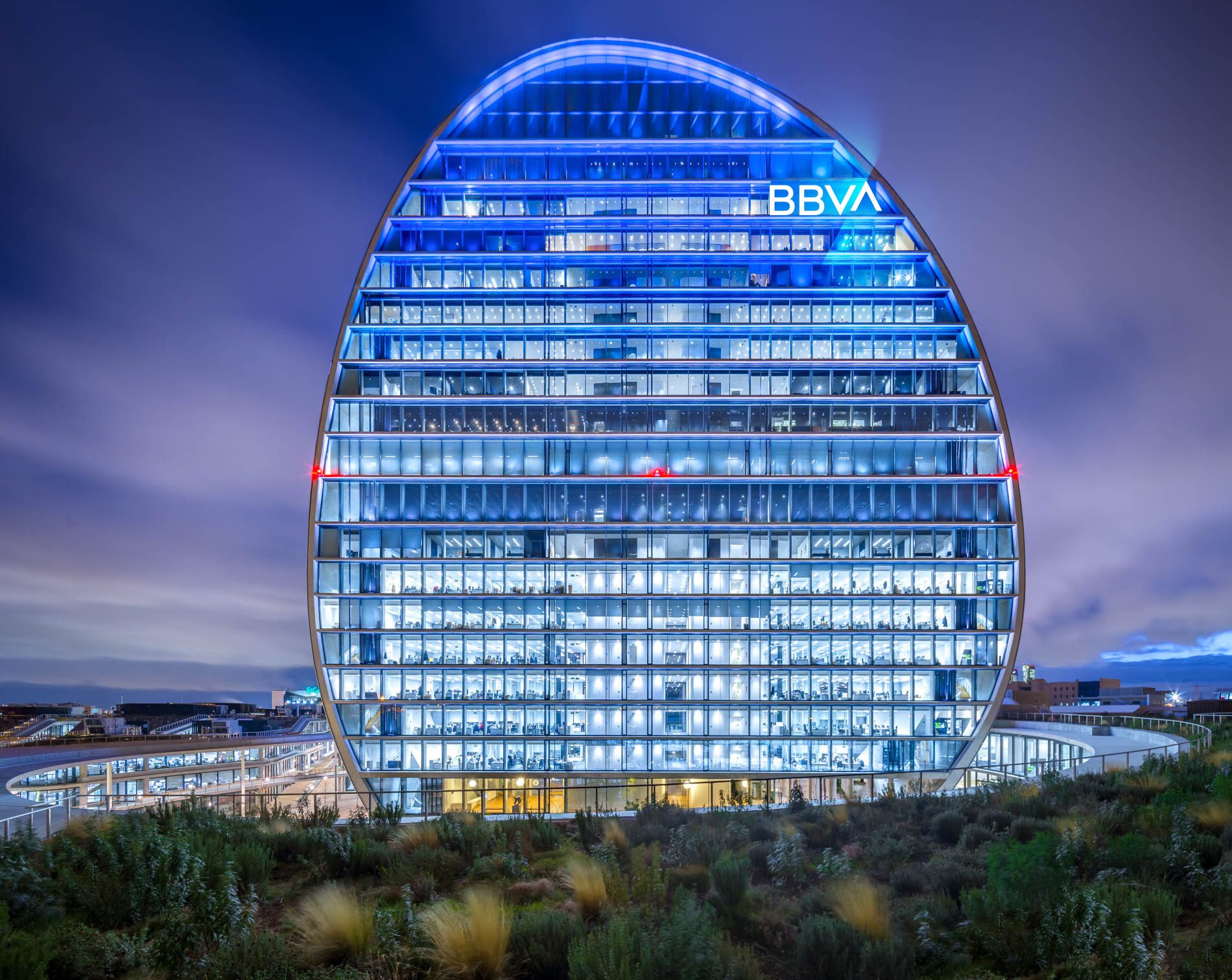
We rebuilt the iconic wordmark around one typographic gesture: the “A” became an ascender, a symbol of opportunity and growth.
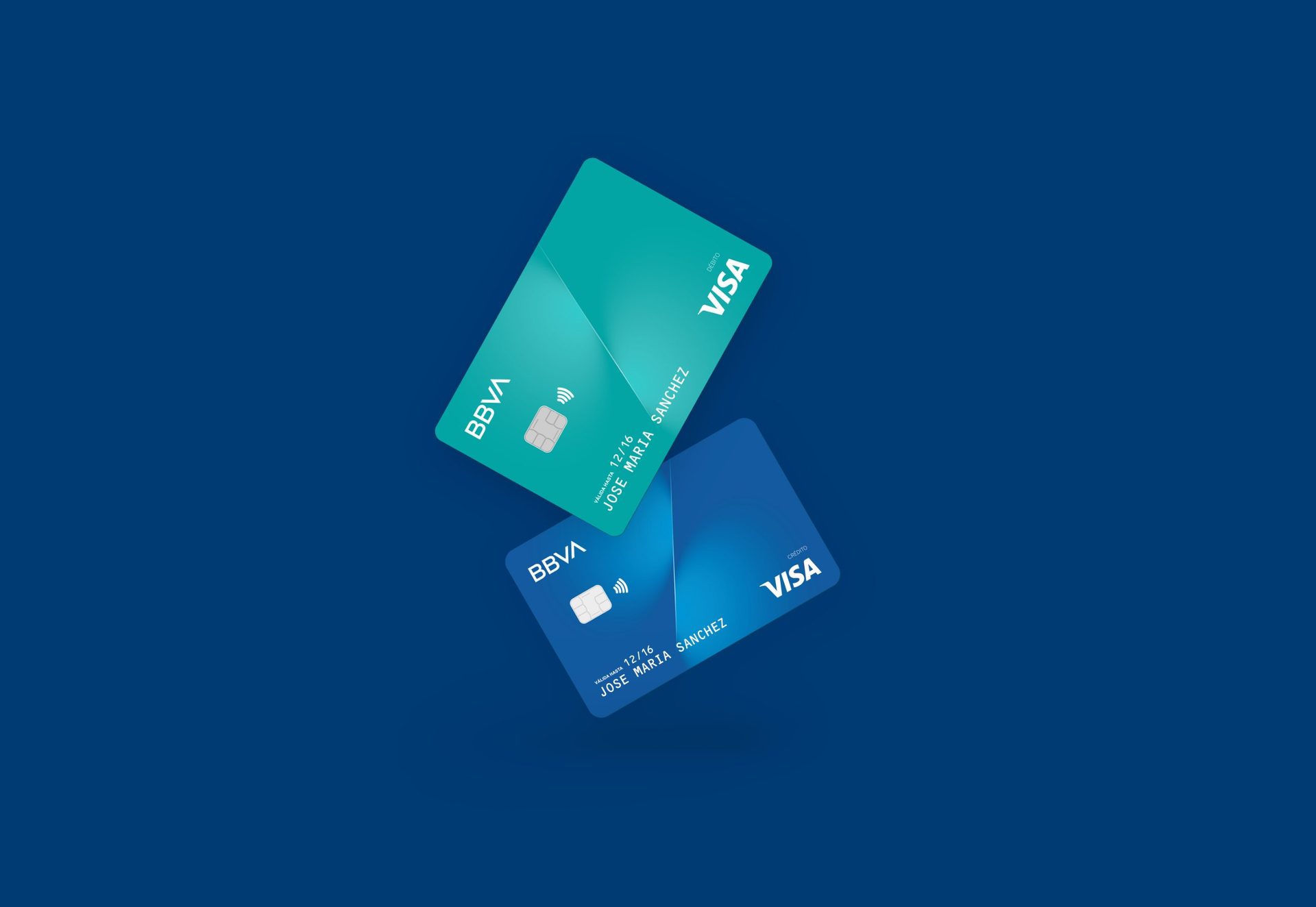
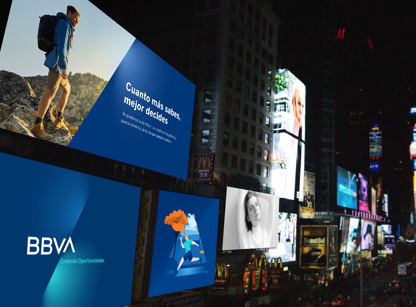
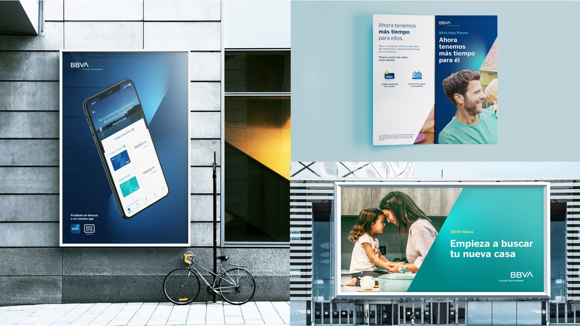
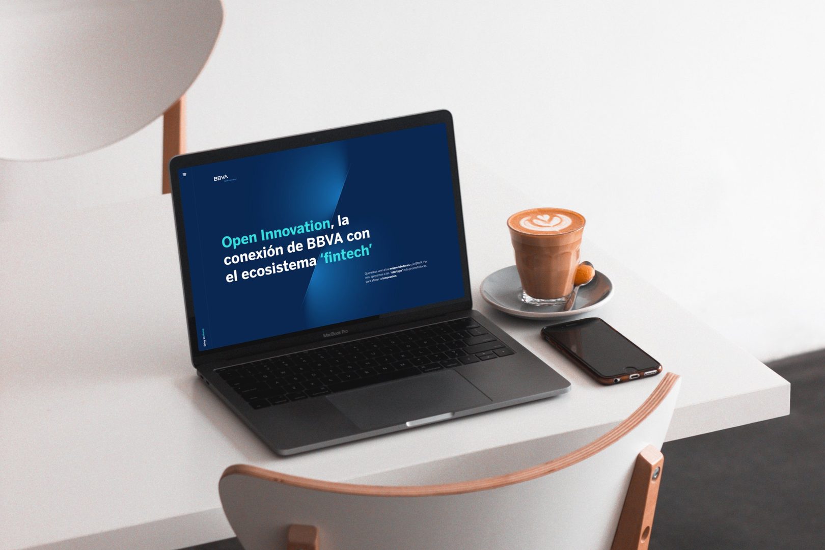
Designed digital first, the new identity kept the familiarity of the original while creating a more modern, globally consistent brand system.
Light and elevation became the core of the wider visual language.




The result
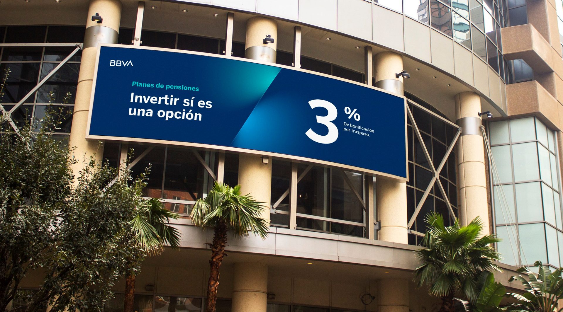
The rebrand united BBVA as one brand across more than 30 countries, replacing regional names such as BBVA Bancomer, BBVA Francés and BBVA Compass. The rollout covered more than 3,000 digital platforms and 8,000 physical locations, helping products, services and digital innovations scale faster across markets.
The ascender quickly became a distinctive, ownable asset, and BBVA one of the world’s most digitally forward banks. Customer research after launch showed stronger brand connection and differentiation versus competitors.

- My role
- Senior designer and pitch lead: ran an inspiration session in Madrid to open up ideas, then crafted the final solution
- Agency
- Landor
- Duration
- 3 months
- Scope
- Brand strategy, brand architecture, identity, wordmark, visual language